Are you new to design and not sure where to start? Creating a brilliant design for a graphic or a flyer is more than just choosing an image and some text.
The execution requires a knowledge of some basic design principles to create a cohesive and professional composition. These basics will give you a good foundation to create inspiring and functional designs for graphics, marketing materials, photography and social media.
This post will cover these design basics:
- Colour—primary, secondary, tertiary, value
- Typography—typeface, fonts, style, weight, formatting
- Elements—line, shape, texture, space
- Principles—balance, emphasis, proportion, repetition, rhythm, harmony
- Composition—focal point, grid, rule of thirds, golden ratio
- Useful Resources
Design is a plan for arranging elements in such a way as best to accomplish a particular purpose.
Charles Eames, Designer
Colour
Colour is probably one of the most important design elements.
The use of bright or muted, light or dark, pale or vibrant colours, cool or warm colours, will effect the design and help move the viewer’s eye to the important information. It can be used as a background and applied to lines, shapes, textures or typography.
Colour is quite subjective, emotional, and can appeal differently to people. When making a colour choice, we should keep in mind the mood each colour generates. You need to select colours that align with both your brand and the content of your design.
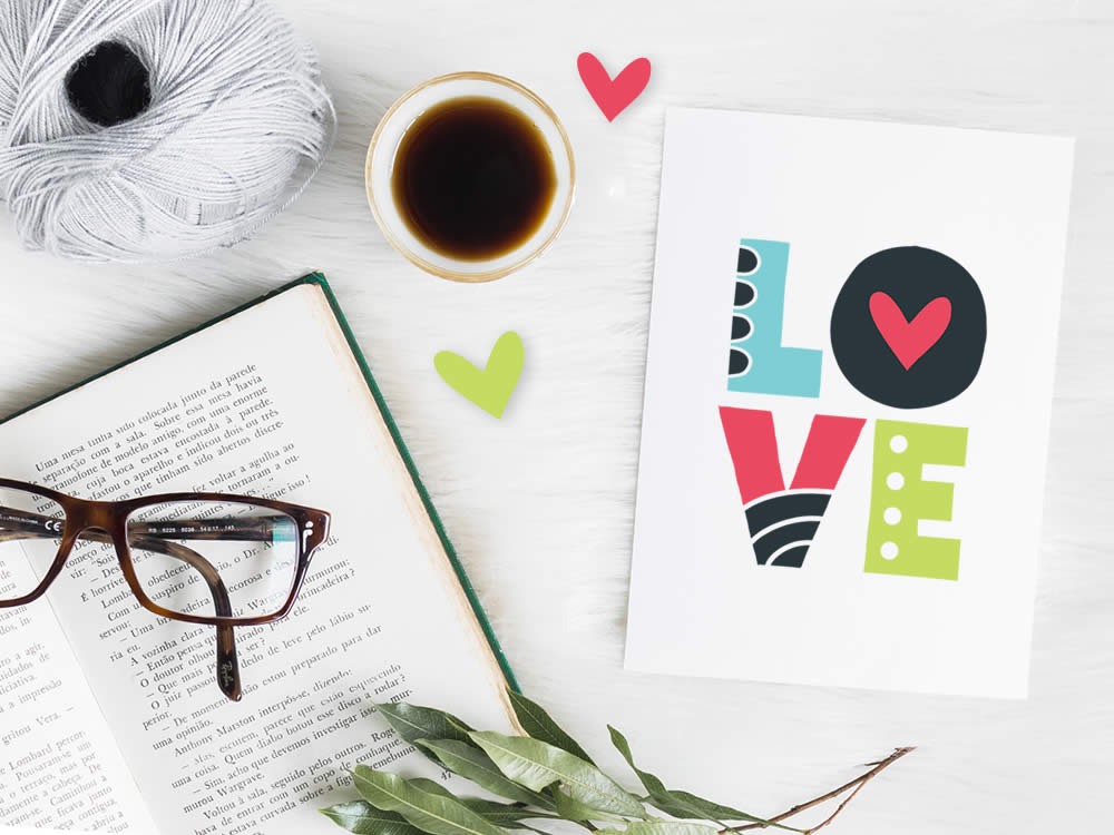
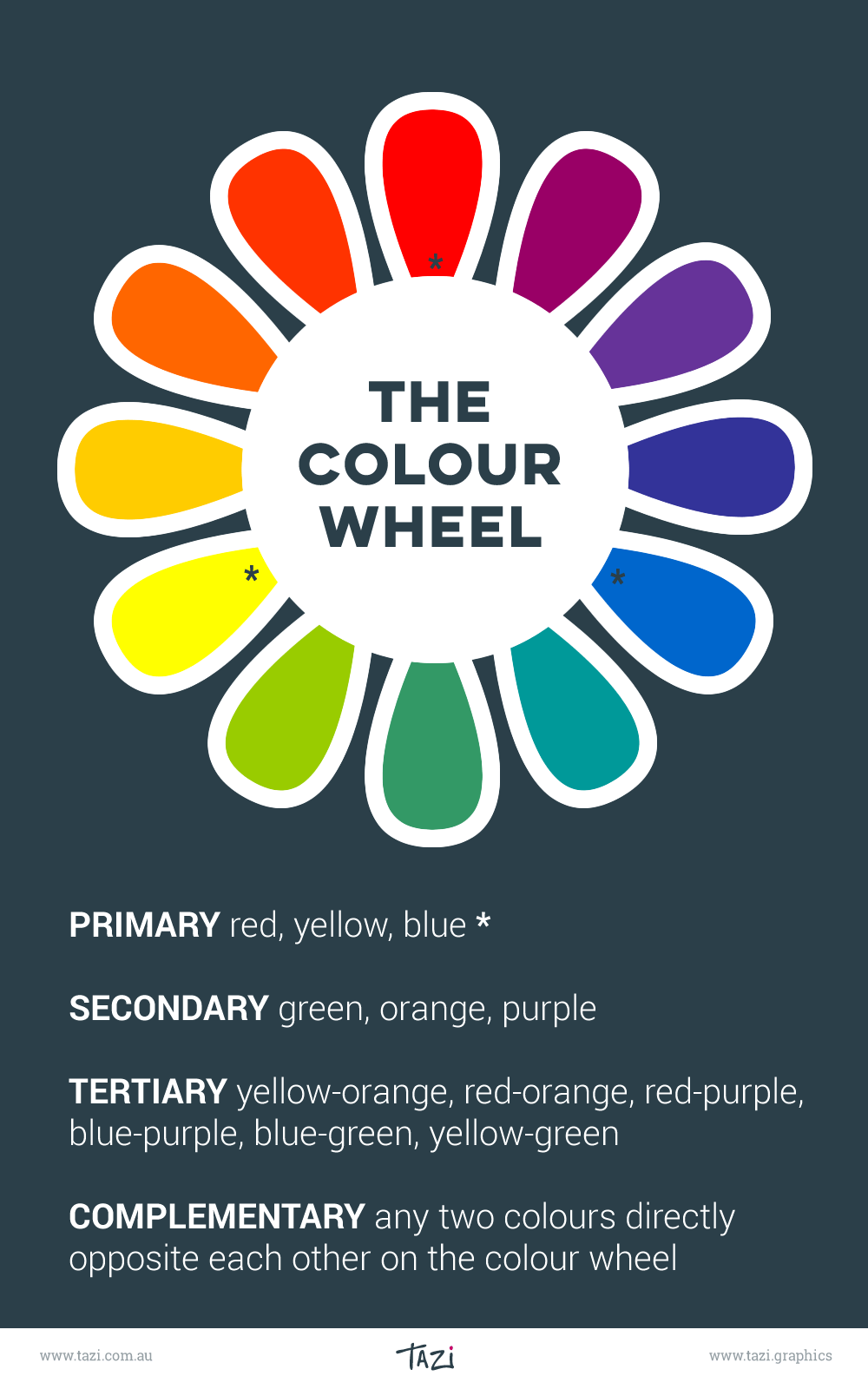
The colour wheel is an abstract illustrative organisation of colour hues around a circle, which shows the relationships between primary colours, secondary colours and tertiary colours.
- Primary colours: red, yellow and blue
All other colours are derived from these three hues. - Secondary colours: green, orange and purple
These colours are created by mixing the primary colors. - Tertiary colours: yellow-orange, red-orange, red-purple, blue-purple, blue-green & yellow-green. These colours are created by mixing a primary and a secondary colour.
- Complementary colours: any two colours which are directly opposite each other on the colour wheel, such as red and green and red-purple and yellow-green.
- Neutral colours: white, black, and grey
Value is one of the most noticeable aspects of colour, and the easiest way to see this is to convert your design to greyscale. High value contrast areas will tend to stand out first.
Did you know that people make up their minds within 90 seconds of their initial interactions with products and about 60‐90 percent of the assessment is based on colours alone.
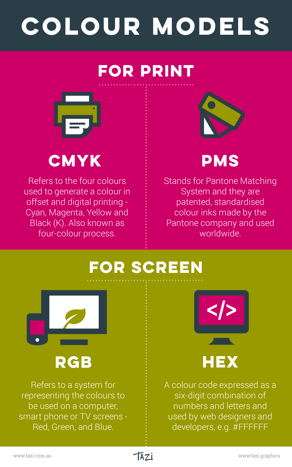
The Colour Models
A colour model is a way to define colour and how colour will appear on the computer screen or on paper. RGB and HEX are for onscreen. PMS and CMYK are for print.
- RGB—(Red, Green, and Blue) refers to a system for representing the colours to be used on a computer, mobile phone or TV display.
- HEX—Designers and developers use HEX colors in web design. They are expressed as a six-digit combination of numbers and letters defined by its mix of red, green and blue (hexadecimal colour).
- CMYK—(Cyan, Magenta, Yellow and Black) refers to the four colours used to generate a colour in offset and digital printing. Also known as four-colour process.
- PMS—(Pantone Matching System) are patented, standardised colour inks made by the Pantone company and are used for printing. Designers use the color swatches to pick colours, and printers refer to the same swatches. This ensures everyone works to the exact same colour and it is always consistent.
Typography
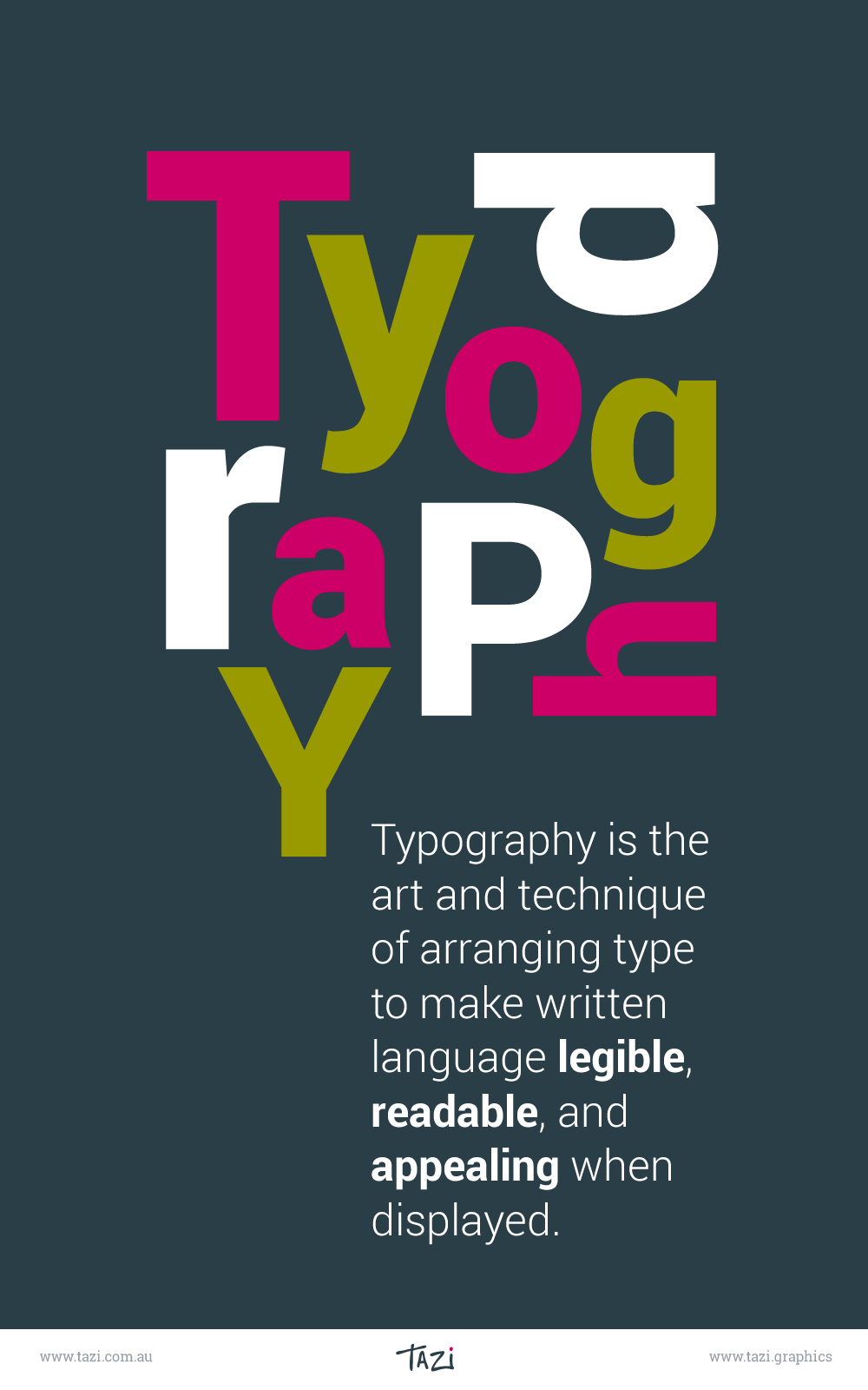
Typography is the art and technique of arranging type to make written language legible, readable, and appealing when displayed.
The arrangement of type involves selecting typefaces, point sizes, line lengths, line spacing (leading), and letter spacing (tracking), and adjusting the space between pairs of letters (kerning).
Your choice of typography should help unify your design with your brand and the other elements. It’s good to explore new fonts and try to mix and match, but don’t overdo it. The goal should be readability and clarity.
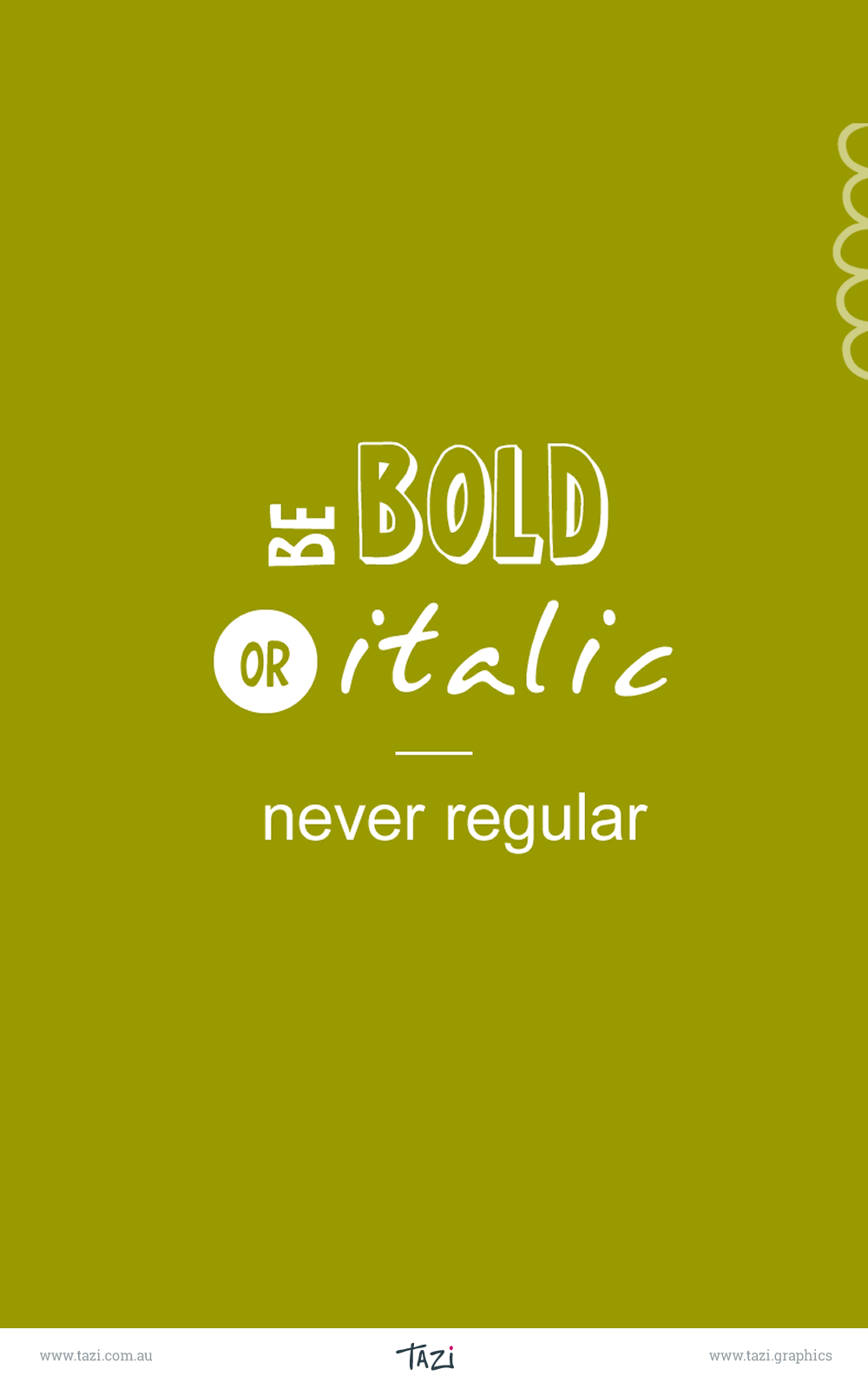
A typeface (or font family) is the overall design of lettering; the design can include variations, such as extra bold, bold, regular, light, italic, condensed, extended, etc. Each of these variations of the typeface is known as a font.
The range of typefaces available is extensive, so choosing the right one can be both fun and tricky. Google fonts have a great range of free fonts suitable for web and print.
Typeface categories
- Serif fonts have a decorative element (serif) at the end of each stroke, e.g. Garamond, Baskerville, Bodoni. They can feel timeless, respectable, elegant and traditional.
- Sans serifs fonts do not have serifs, so they feel clean, uncluttered, stable and modern, e.g Helvetica, Arial, Roboto. The rounded edge fonts can feel a bit more friendly or happy e.g. Museo Sans Rounded, VAG Rounded.
- Slab fonts have a solid slab element at the end of each stroke that can make them seem bold, strong, and collegiate, e.g. Lubalin, Rockwell.
- Script fonts are based on the flow of cursive handwriting. Use these fonts to convey a sense of elegance, femininity, historical or whimsy, e.g. Beautiful Script.
Readability and legibility
Typography is the visual appearance of text. The goal of typography is to ensure that text is readable, and also a pleasant experience for the reader. This is achieved firstly by our choice of fonts and then with the formatting, line height, line length and kerning that we select. Each font may require different adjustments, particularly for print.
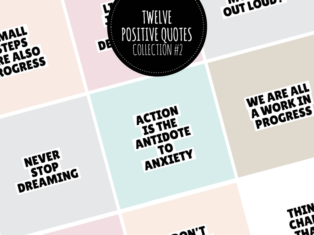
A paragraph of all caps (all letters are capitalised) is harder to read than a paragraph of lowercase text because it is the varied visual contour that helps our brain recognise words when we are reading. Reading all capitals is tiring on the eyes so it should be used sparingly.
Hyphen and dashes are not interchangeable:
- A hyphen is the shortest one and is used to hyphenate words if a word breaks onto the next line, or for compound words such as world-changing or joining two names in a surname, eg. Tanya Smith-Button.
- The en dash is mostly used to indicate a range of values, eg. 0–100 or joining two unrelated names in a phrase, eg. Sarbanes–Oxley Act.
- The em dash is used to make a break between parts of a thought or sentence—in many ways similar to semicolon.
Here are some other formatting tips:
- Only use one space between sentences. One space is the standard—two spaces adds extra white space and adversely affects readability.
- Don’t underline because it makes text harder to read.
- If you are using quotation marks, make sure you use the smart/curly quotes not the straight ones.
- Don’t use quotation marks for emphasis. Use bold or italic.
- An ellipsis is a sequence of three dots used to indicate an omission in quoted material. You can add a space before and after the ellipsis if desired.
Useful typography terms
Did you know, the terms uppercase and lowercase come from traditional print shops? Capital letters, used less frequently, were stored in a case on a shelf above the other letters.
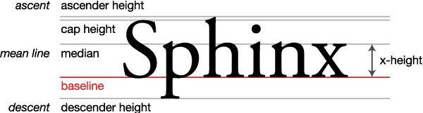
- The baseline is the line upon which most characters are placed.
- The median is the ceiling for most lowercase letters.
- The x-height is the space between the baseline and the median. This is determined by the height of the lowercase letter ‘x’, hence its name. The greater the x-height, the more readable it will be at smaller sizes.
- The ascender is that part of the letter that stretches above the median, e.g. h,f.
- The descender is the part of a character which extends below the baseline, e.g. y, g, p.
- Counters are areas that are partially or fully enclosed, e.g. a, o, p.
- Line height or leading is the space between two baselines. A good line height for paragraphs of text is between 1.3–1.6, but multi-line headings may be less.
- Line length refers to the number of characters on a single line of text. A good length for readability on the web would be 60–85 characters.
- Letter spacing or tracking refers to the consistent spacing between all of the letters in a group.
- Kerning refers to adjusting the varying whitespace between individual letters or numbers, e.g. between 1 and 0, f and i.
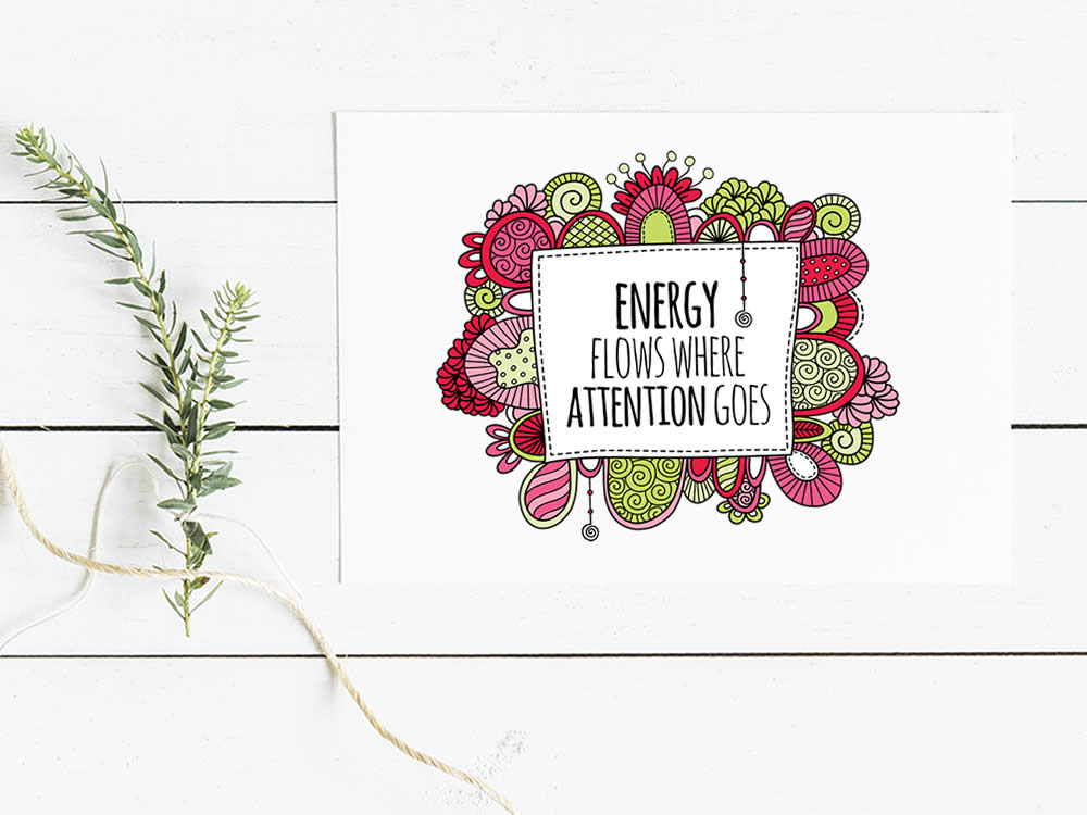
Design Elements
Along with colour and typography, line, shape, texture and space are important elements that contribute to the strength of a design.
Lines are useful for dividing space and drawing the eye to a specific area. For example, lines can be used to separate content, headlines and side panels. They can be long, short, straight, thin, coloured, dashed, dotted or curved and each choice will have a different impact.
Shapes can be geometric, abstract or organic and add interest and emphasis to a layout. The choice of shape, size, position, colour, style, background or texture can totally change the overall effect.
Space is very important in your design. White space or negative space allows the eye to be drawn to key areas, by creating emphasis and hierarchy. White space doesn’t actually have to be white, it can be any space around the elements. It improves legibility and is a visual cue that there’s a break in the content or that the content is finished. It can be introduced by scaling down your graphic elements.
Texture can be subtle or strong and is a design element that can be used to create interest and contrast. Textures include paper, stone, concrete, brick, fabric and other natural elements.
There are three responses to a piece of design—yes, no, and WOW! Wow is the one to aim for.
Milton Glaser
Design Principles
Design principles include balance, emphasis, proportion, repetition, rhythm and harmony. They are handy tools for using ‘design elements’ to create a successful composition.
Balance is how the elements of a design are laid out and there are three types of balance: symmetrical, asymmetrical and radial. Symmetrical balance is when the weight of elements is evenly divided on either side of the design, whereas asymmetrical balance uses scale, contrast, and colour to achieve this visual balance.
Emphasis is the creation of dominant and sub-ordinate elements in a composition and is also known as visual hierarchy.
Proportion represents the scale of elements compared to each other. Generally larger elements will have a stronger impact on the user than the small ones. If everything is the same size it will look boring and nothing will stand out.
Repetition can create unity within a design. This could be a style of type or a graphic icon that can be used more than once. Your design will be more cohesive with the use of repeated elements.
Rhythm uses repetition, contrast and progression to encourage the eyes to move from one element to another and controls the order that the elements are viewed.
Harmony is what you get when everything works well together. If the elements complement each other, and the design is balanced and flowing, that is the ultimate goal.
A designer knows he has achieved perfection, not when there is nothing left to add, but when there is nothing left to take away.
Antoine de Saint-Exupéry, French writer and poet
Composition
In graphic design composition is commonly referred to as page layout and a successful composition means that all the elements have been arranged so that it is both complementary and effective.
A strong focal point is a key element to a composition that ensures the most important part of your design is seen first. This could be a single image, or a very large heading.
Grids can bring organisation to the design process by creating a simple, clean, structure to help you place and align elements.
The rule of thirds is a fundamental guideline that was first written down by John Thomas Smith in 1797. The guideline proposes that an image be divided into nine equal parts by two equally spaced horizontal lines and two equally spaced vertical lines, and that important elements should be placed along these lines or their intersections. Aligning a subject with these points creates more tension, energy and interest in the composition.
The golden ratio combines maths, nature and design. It has been used throughout history to create design elements that have an ideal visual appeal and is the perfect combination of balance and harmony. It’s another tool to help you create something that establishes the right emotional and visual tone with users.
The public is more familiar with bad design than good design. It is, in effect, conditioned to prefer bad design, because that is what it lives with. The new becomes threatening, the old reassuring.
Paul Rand, graphic designer


Resources
These are some of apps and resources that I find very handy to create high quality designs and layouts:
- Canva
- Pixlr
- Free Photos – Unsplash, Pixabay, Ivory Mix
- Shutterstock
- iStock
- Adobe Stock
- Adobe Creative Suite
- Color-hex
- Creative market
- Iconmonstr
- Google Fonts
A successful design or composition will use some of the basic principles outlined above to bring all the elements together in a way that makes sense and hopefully leads to a ‘wow’!
This post may contain some affiliate links, so Tazi Graphics will get a small commission if you buy something through those links.