Good design for young children means creating visual designs, services and products that will allow and encourage these qualities to flourish and go beyond the typical gender stereotypes.
Children have many beautiful qualities such as imagination, creativity and expression.
One of the most important aspects of design in children’s media is the effective use of colour and graphics so the content provides a memorable user experience to young users.
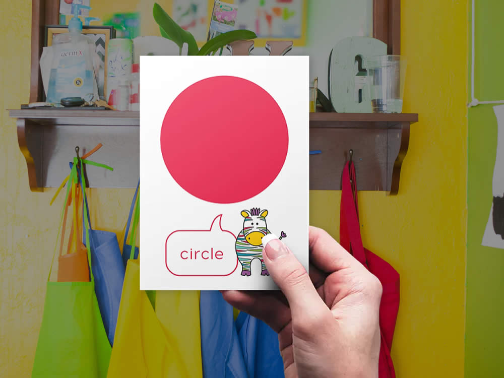
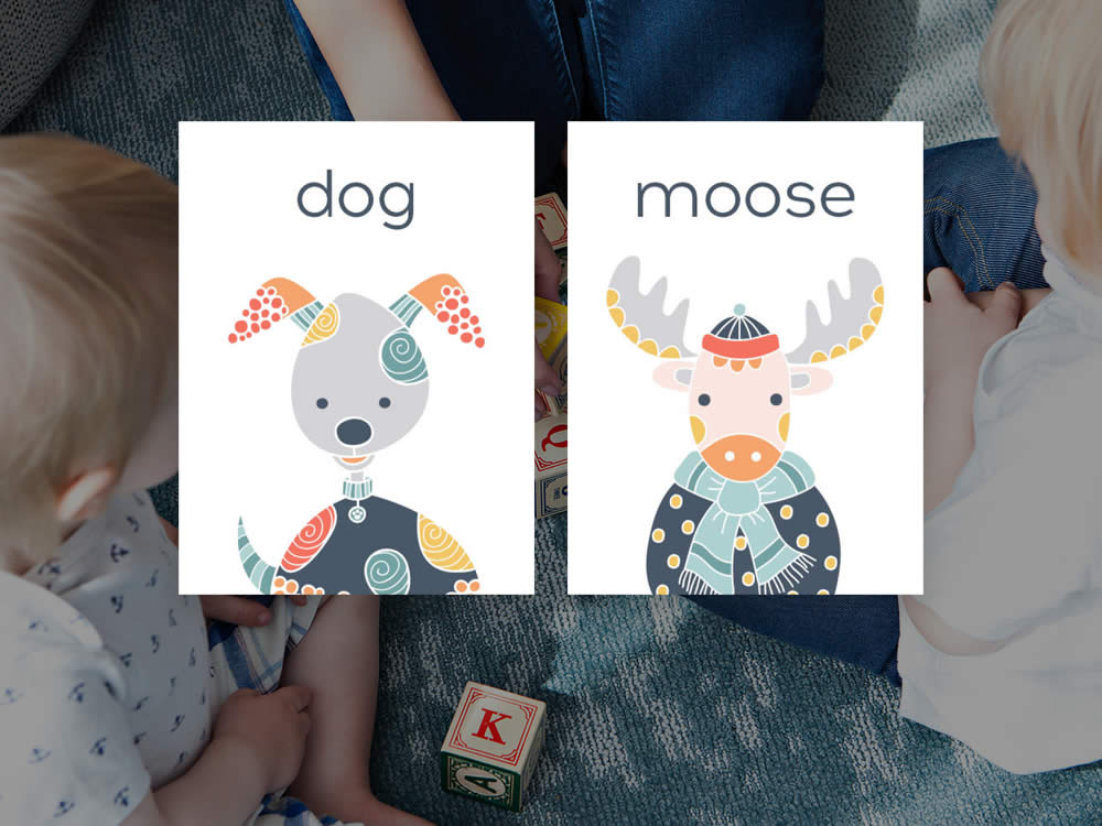
1 | Graphics
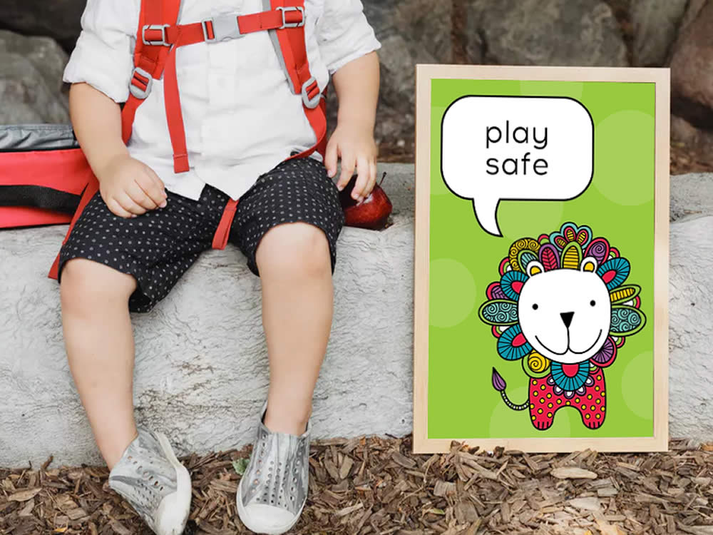
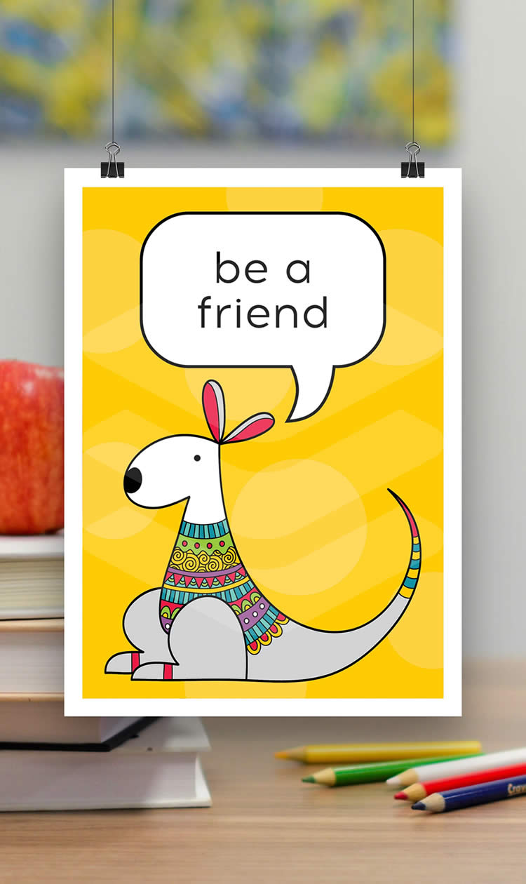
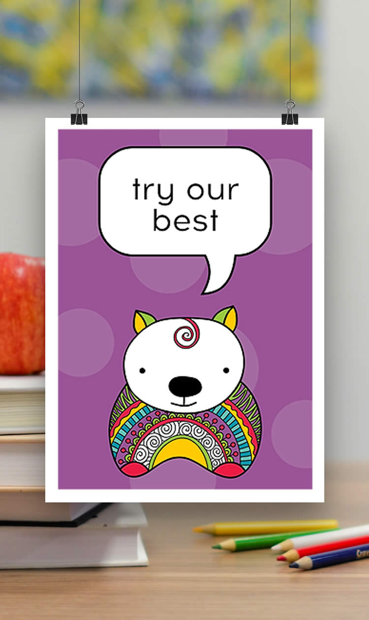
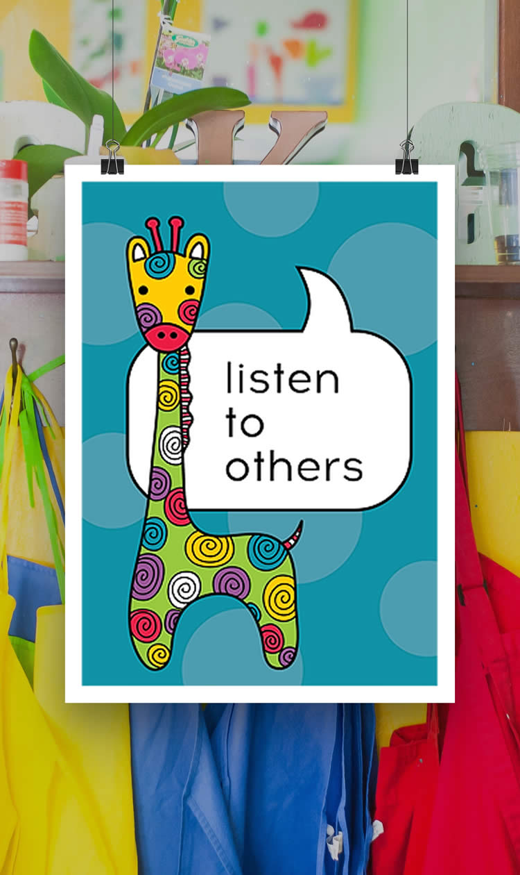
A cute mascot or cartoon character is very relatable for kids and helps to create a strong visual connection. The funnier or more unusual the mascot, the more it will be remembered and stand out.
For this age group, keep the graphics and colour choices gender neutral to appeal to both boys and girls. Where possible avoid the traditional stereotypes of ‘pink princesses’ for girls and ‘blue dinosaurs’ for boys.
2 | Colour
Young children will generally prefer vibrant, high contrast, primary colours. According to Essential Baby:
- Experts say by three months most babies are able to see colour, with a preference for bright primary colours for brain stimulation.
- Around 18 months, a child will begin to differentiate between colours.
- By approximately three to four years, a child will begin to recognise, identify and name basic colours.
The three primary colours are red, green and blue and cannot be mixed from other colours. They are the source of all other colours. The secondary colours are orange, green and violet. Secondary colours are mixed from two primary colours adjacent to each other on the colour wheel.
3 | Layout
Consistent layouts that are not too complicated and display a simple visual hierarchy are the best for young children.
Simple, clean layouts that achieve a good balance between text, fonts, alignment, colour, and graphic elements will be most appealing.
The use of negative space, or white space helps with balance and hierarchy. According to Wikipedia, “White space should not be considered merely ‘blank’ space — it is an important element of design which enables the objects in it to exist at all; the balance between positive (or non-white) and the use of negative spaces is key to aesthetic composition.”


4 | Text
Keep your use of language simple as young children are pre-readers or beginning readers and will be more attracted to the graphics and colours.
Large, bold headings will capture attention and help to divide the content into sections.
Allow generous leading, line heights, and space between sections, so kids can easily identify different letter forms and sections of content.
Avoid using all capital letters, as that can hinder readability for young children.
5 | Fonts
It is common practice to use sans serif fonts for children, because of their fresh look and simplicity.
Steer clear of distorted, decorative, or cursive letterforms as these are too complex for young children to understand. Choose a typeface with well-defined contours and generous space between letters.
Some fonts that offer good readability include Futura, Sassoon Primary and Gill Sans Infant. These fonts have generous letter spacing, no serifs, and big counters (the enclosed shapes within characters).
Ideally select fonts with one-story ‘a’s and ‘g’s (also called infant characters), since these are the lowercase shapes preschoolers will learn to write.
The font size should be larger for preschool and beginning readers.
6 | Designing for children
The Children’s Design Guide has evolved to help guide designers and creators of children’s products, services and content, to focus on the best interest of the child.
“We want children to have the best opportunities in life and to encourage rich, ethical content for self-expression, creativity, and play.”
They believe that every designer has the potential to have a positive impact on children’s daily lives and development and should:
- Consider age appropriate wording communication as well as language translations.
- Always consider the benefits and disadvantages of analogue and digital in design development.
- Consider developmental stages including emotional-cognitive, social and physical development and create age appropriate research and design.
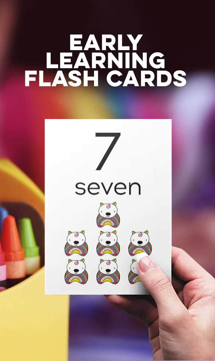
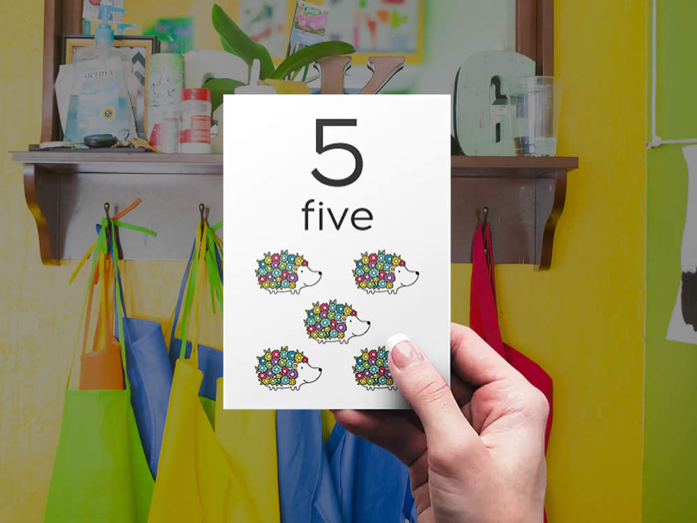
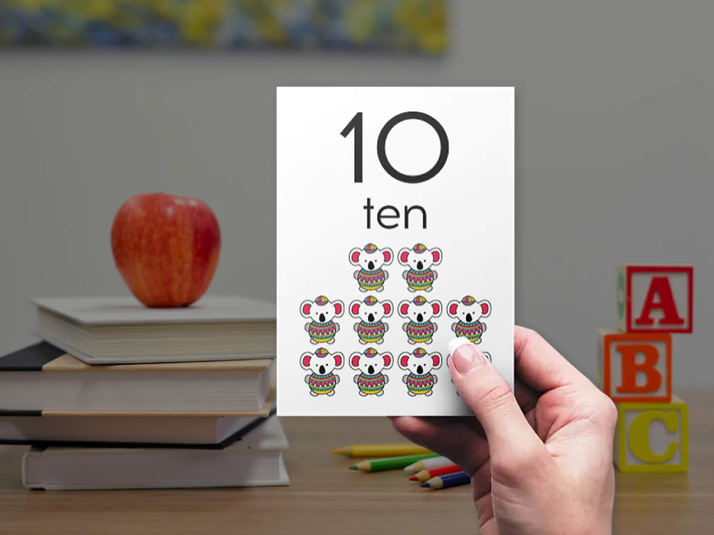
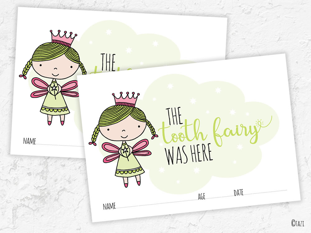
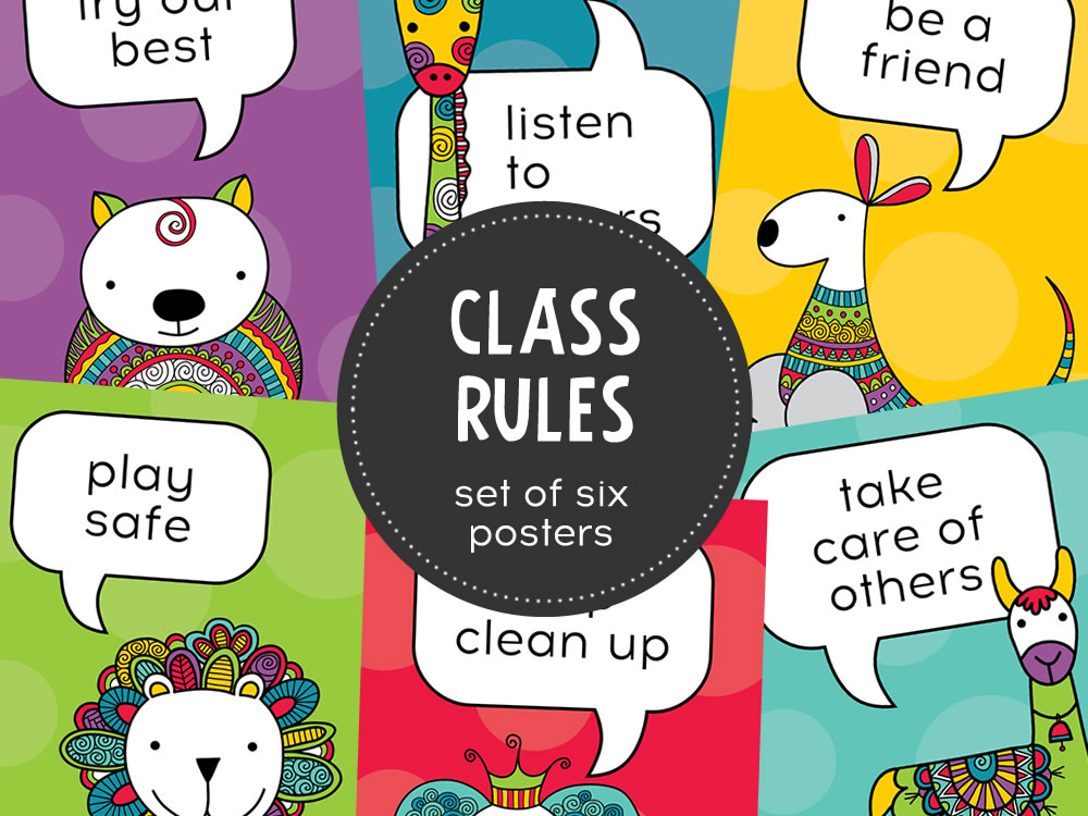
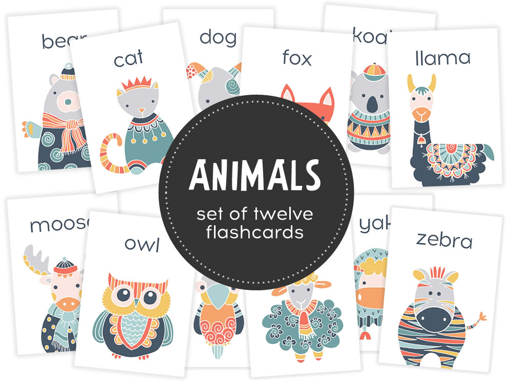
Early Learning Materials
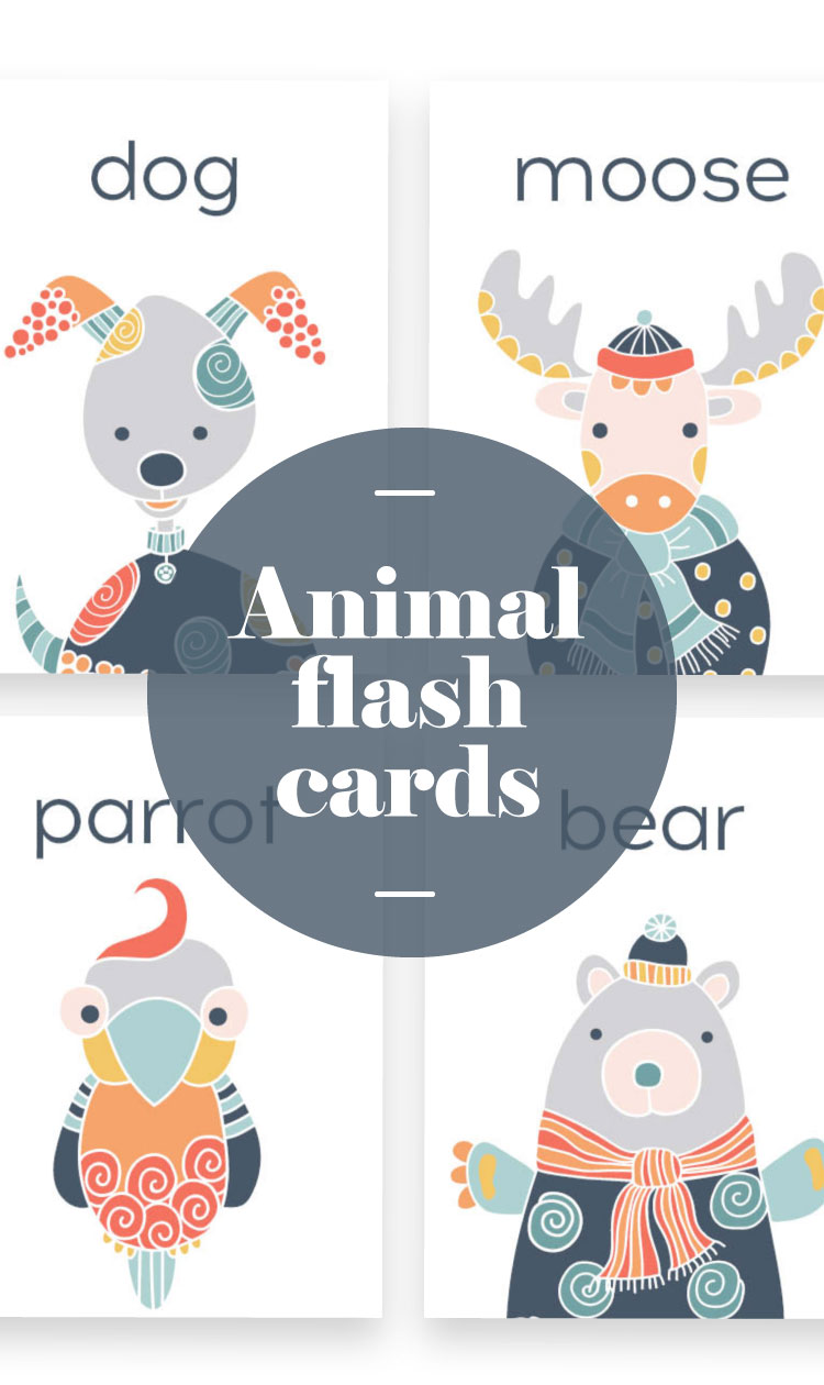
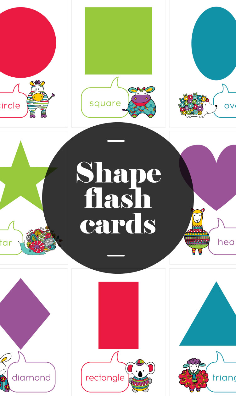
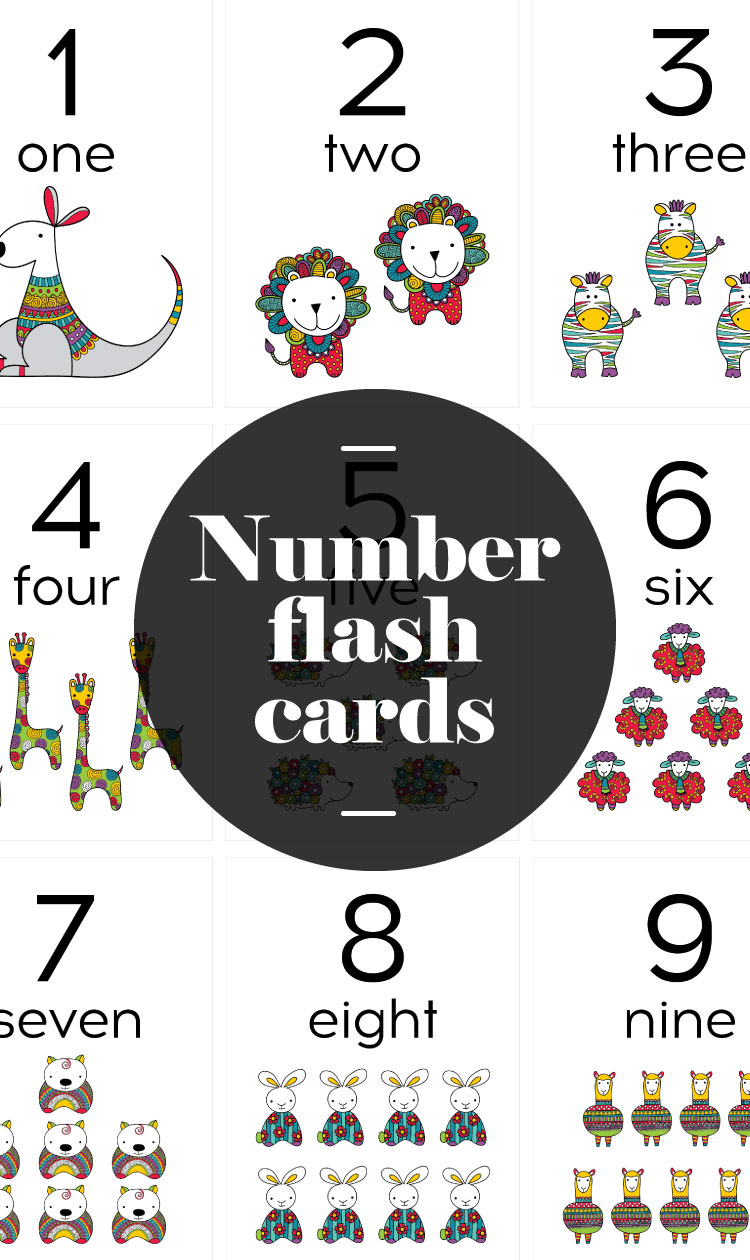
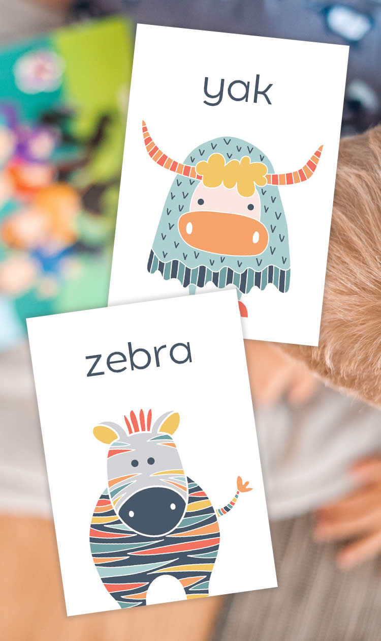
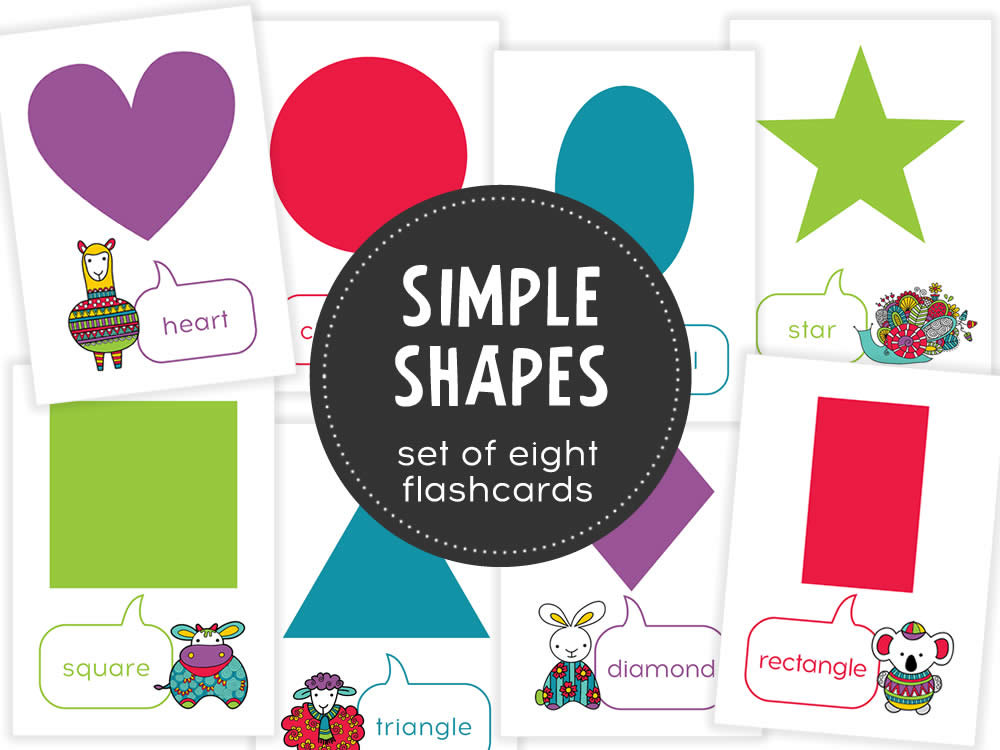
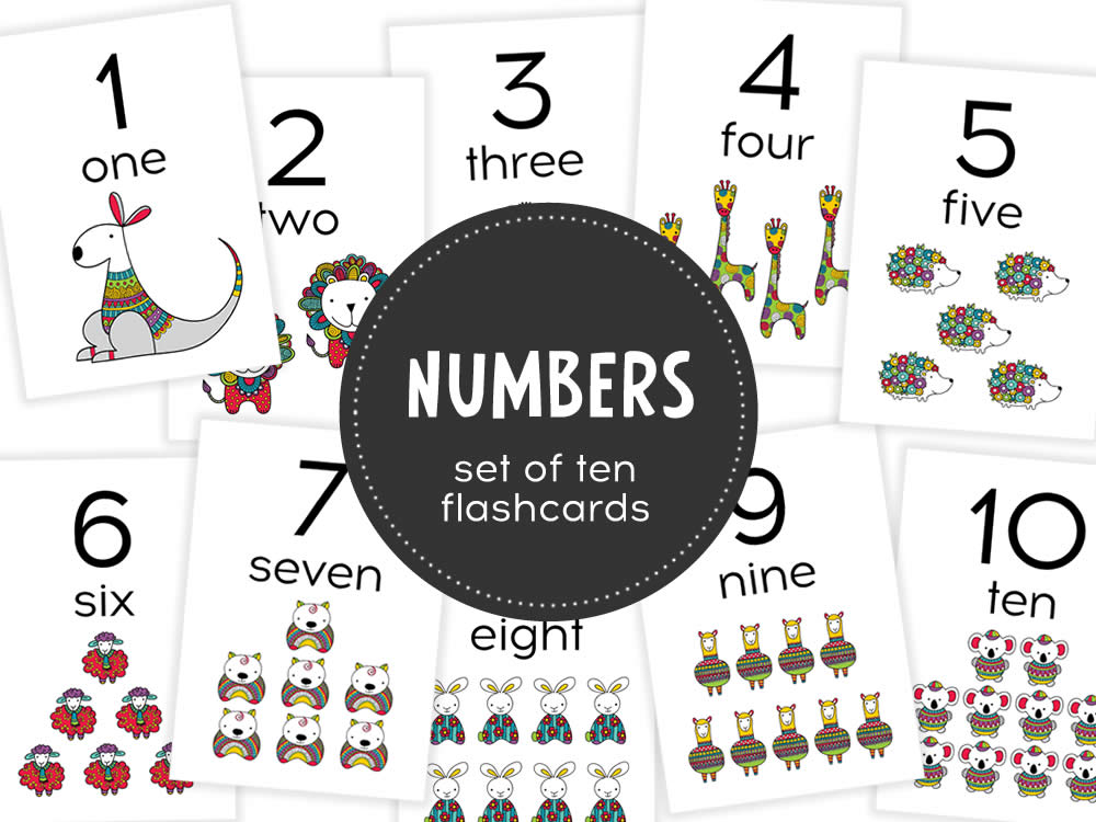
Educational materials such as flash cards, worksheets, posters, awards, handouts, task cards etc come in all shapes and sizes, and they enhance the learning process.
The resources that we create for child care, preschool, kindergarten, and home-schooling, and use on a day-to-day basis with young children should be high quality and engaging.
The Early Years Learning Framework (EYLF) offers a vision where ‘all children experience learning that is engaging and builds success for life’.
“For a child everything is a potential learning experience. As educators we need to think about how learning can be part of every moment of the day.”
Australian Government Department of Education
“Childhood does not have to be hurried. Sometimes the best preparation for being five (or four, or three, or two…) is to be four (or three, or two, or one) for a whole year.”
Australian Government Department of Education
“By engaging in shared thinking and conversations we help children’s thinking and learning to become richer and more complex.”
Australian Government Department of Education